May 23, 2016

MAISON & OBJET: Textiles, furs, brass and glass OH MY!

Maison & Objet is a lot like sticking a child in a candy store, with endless selection and new shiny things in every corner, it is hard not to get lost in this world of style and whimsy. During our time at Maison & Objet at the Miami Beach Convention Center, we came across a lot of trends that we see not only in furniture but even fashion. Here are some of our favorite trends, that to put it simply, are KILLIN’ IT!


Cobalt Blue 
FENDI CASA - MAISON & OBJET - SIRE DESIGN

YES! Blue is such a romantic hue. Sure we associate love and passion with red and pink and shades of blush, but blue is the color of the sky that gently welcomes us to each day, the color of the ocean that we dive into to wash away our worries and now, the statement color of the moment. One of our favorite examples was from our friends at Fendi Casa who brought in one of our favorite designers Paul Mathieu to put blue back on the map. Check out this amazing set up


Table Clusters

FENDI CASA - MAISON & OBJET - SIRE DESIGN
Why have one table when you can have 4 or 5 or even 6 of these really chic petit tables to create a layering world of space and design. We had seen this before at Minotti and now we saw this everywhere we looked at Maison & Objet. This seems like a trend, but certainly taste this good will become a classic. Perhaps, we will be sharing with you some of our favorite layering tables in some of our projects (hint hint - we are sharing that with you!) Here is an example of how Maison & Objet layered on the style


Mid-Century Style
FENDI CASA - MAISON & OBJET - SIRE DESIGN

Wood grain visible in modern furniture pieces, brass, color schemes of blues, emerald greens and earth tones come colliding together to form nothing short of an operatic moment. Bold and understated this is a trend that we hope never goes away. Many times we find that design gets ahead of itself and has to employ some of the more classic elements to make futuristic design that much more interesting. This is one of our favorite examples of Mid-Century style announcing that it is back and here to stay


Throwback 
FENDI CASA - MAISON & OBJET - SIRE DESIGN

We love this retro meets subtle tones of modern day! We affectionately title this trend “throwback” because it is where brass and marble dance. It is a perfect example of today paying homage to yesterday. We hope you enjoy these throwback elements as much as we did.


We're revamping our website & blog and can't wait to share the new look and features we've create just for you!


April 12, 2016

TILE SCHOOL: 5 Tips for Choosing Bathroom Tile


Welcome to the first post of our Tile School blog series. In the next few weeks we will be sharing with you the do's and dont's of all things tile, together with all those questions and answers you should know about the wonderful world of porcelain, marble, mosaics and more.

As one of South Florida's Top Interior Design Firms, we are not new to the use of tile in our projects. In fact, tile is our go-to material to use when we want a wow factor in our interior design projects. Most of the time we get clients who love the use of tile throughout various parts of our renovation projects but simply aren't sure how to incorporate them or fear the maintenance associated with its installation. In the paragraphs that follow we will guide you through tips that will make selecting your bathroom tile the easiest task on your renovation list!

Class is in session!

You're all set, you have the perfect design concept in mind for a bathroom remodel, you're ready to go and then out of nowhere you become unsure about creating the vision in real life. Well you're not the only one. Selecting the proper fixtures and color palette is fundamental, but most importantly the tile you select will define the space for long time to come.

Here are 5 tips that work as a guide into creating the bathroom design you've envisioned for so long. 

1. PICK YOUR MUST HAVE TILE FIRST.

Typically when we start a bathroom renovation we have one tile that we dream of including in our design. This tile most of the time has something that is really special or its look provides a unique accent tile to the space. Sometimes its as simple as knowing you want white subway tile, which is a timeless classic go-to in my book. Either route you go, take that dream tile and use it as the starting point for the other tile you will choose for your bathroom design.

Here are a few of our favorite must-have tiles:


DUMONT MILAN GRAY MARBLE TILE


http://tilebar.com/vzag-nero-and-brass.html
VZAG NERO AND BRASS


HIGHLAND SUPERNOVA


HAWTHORME ALBESCENT TILE 


2. TRY TO KEEP IT NO MORE THAN 3 DIFFERENT TILES.

Using your first (must-have) choice as a starting point, use it to make the decision for the other tiles you will include in you design. If your must have is a really unique color or pattern and is going to be the focal point of your design, pull more subtle colors from it to use in your accent tiles. However, if your must have tile is really subtle (like a subway tile) you may want to add an element of interest with a colorful accent tile or even a smaller scale white penny tile to change it up a bit and add some interest.

Normally you choose a floor tile, a wall tile for the shower/tub area or even all the walls in your bathroom and an accent tile that will be used as a focal point. Now just to be clear, this is a guideline. Feel free to break these rules a bit if you feel like you can tackle it.

SOURCE


SIRE DESIGN COLOR PALLET FOR UPCOMING BATHROOM RENOVATION - VZAG ANTIQUE MIRROR

TENNESSEE TAUPE HEXAGONS POLISHED MARBLE TILE 

TERRINE JUPITER BLEND 1X1 GLASS TILES

3. STICK TO ONE SHOW STOPPER.

Lets be real, there's hundreds even thousands of beautiful tiles to pick from and a bathroom is a perfect place to show off some of your personality and take a risk with a beautiful color or pattern on your tiles. However, if you are going for it, keep it to one show stopper. Think of your bathroom tile as a runway show. We all know fashion designers leave that one amazing creation as the last look in their show. Make your show stopper just that, YOUR WOW FACTOR. By doing this, you'll make your look timeless and really create that focal point that you are going for since it won't be competing with the other elements in the room.

Many of these superb tiles can be pricey depending on your budget, but if you're working in a small area like a bathroom, they will always be worth the splurge since you won't need very many square feet. Your show stopper area can be big or small, it's all up to you!

Check out a few show stopper examples below:

BRAZILIAN TIGER BLUE TECH POLISHED 24X48 PORCELAIN


GATSBY SILVER NERO AND THASSOS WITH CHROME LINE
                                   

4. TAKE MAINTENANCE INTO CONSIDERATION.

Alright let's be honest, no one like to clean a bathroom for hours (except our amazing cleaning lady Martha, God bless her). When choosing a tile its important to take into consideration the maintenance each of these selections require. For wet areas you'll probably want porcelain or ceramic tile because they are virtually maintenance free. Make sure you double check to see if they need to be sealed upon installation. Tiles made from natural stone require more maintenance and do have to be sealed. They are definitely more porous so they tend to hold on to dirt and grime more. If you are wanting to add texture with stone, it may be a good idea to use it on the floor or in a less wet area. Lastly, glass tile is  stunning and makes a great wall or accent tile. It is super slipper, so it doesn't work well on the floor unless you go with a tile marble blend like the one below.

REFELCTION ATHENS GRAY & WOODEN BEIGE MIRROR PENNY

Check out gorgeous glass tile that work beautifully as an accent wall:

ALLURE WATERSCAPE GLASS AND MARBLE TILE

Large scale tiles are the new trend when it comes to bathroom floors. If you choose to go that direction, you can use the same tile cut in smaller sizes in a different area of the bathroom. For example if you use 12 x 24 tiles on the floor, you can use the same tile on the bathroom floor in 2x2s to continue the color across the entire floor, but creating a more slip free shower floor. 

ASIAN STATUARY 3X6 MARBLE TILE

Now the we're covered 5 Tips for Choosing Bathroom Tile, stay tuned for the second part of our Tile School Blog Series: 

5 Things You Should know About Grout and How to Perfectly Choose The Right Color

Xoxo - Eilyn
Sire Design

Share with us your thoughts and renovation tips below :)

For more information about Sire Design, visit www.siredesign.com


October 13, 2015

What do your design preferences say about you?

Everything from how you dress to what you order at Starbucks helps to define who you are, and that extends to decor, too. How we style our homes correlates to who we are and how we want others to perceive us, Lindsay Graham, a PhD in personality and social psychology, explained in an interview with Buzz Buzz Home.

Sometimes we're making these choices consciously, like picking a wild pattern that says, "hey, look at me!" Other times, we're not as aware.

Decorating with lots of blankets and throw pillows, for instance, may mean you desire to make everyone feel welcome in your space. ​But if your home is lacking sitting room for company, it could indicate that you prefer solitude to companionship, Graham notes. Or simply that you're still on an entry-level salary – we've all been there.
If you love design from the Victorian Period, one might argue that you want people to perceive you as sophisticated and elegant. While one who gravitates towards the Art Deco look would more likely be viewed as artsy or a deep thinker. And simple, clean design – like completely bare kitchen counters – could signify a type-A personality, and one who opts for appearance over functionality.

As interior designer Jane Lockhart told Buzz Buzz Home, there's always those who opt for the middle ground of two distinct styles. "I think that when people do designs that are very neutral, where it's not modern and it's not traditional," she said, "they're good peacemakers because they like a little bit of everything."

GoHaus, an online shopping destination for eco-friendly design, has some thoughts of their own on the subject. With its help, and in just four simple questions, you'll know if you're more of a contemporary modern or a late colonial kind of decorator. 

Follow the brand's infographic below to find out which style you should be decorating in.
Give us your input on the quiz above and let us know if it reflects your style!

www.siredesign.com

Courtesy of Go Haus

October 12, 2015

IMPROVE YOUR MOOD WITH THESE 5 DECORATING TIPS


Eilyn Cueto
Neuro-architecture​ may sound complicated and unapproachable, but the concept is actually quite simple: it's all about improving how humans respond to the environment around them. 

You probably already knew this, but the interiors in which we live can actually have an impact on our mood and state of well-being. And according to Wimdu.com, a European rental site, applying neuro-architecture to your home is the easiest way to ensure that experience is positive every time you walk in the door.

Here's how it works:

There are 5 areas of brain activity to consider when creating a space that will boost your mood: sensation and perception, learning and memory, decision-making, emotion, and movement.  According to Wimdu, making a few adjustments tailored to each brain activity will help you create the ideal space.

Improve your ​sensation and perception​ by changing your home's lighting​Remove harsh lights, and replace them with more calming varieties, and use dimmers or adjustable lamps whenever possible.

Bolster your learning and memory abilities by bringing in furniture with rounded edges, as the University of California found that rounded decor can actually encourage more brain activity.

Make decision-making easier for yourself by taking the guesswork out of your day. For example, place a garbage can near your door so you can toss out any unwanted mail right when you receive it, instead of having to decide what to do with it down the line.

Improve your emotional well-being by placing living plants throughout the home. They can reduce stress and bolster concentration.

Finally, focus on how movement can play a part in your response to your home. A change in environment helps improve mood, so keep your decor from becoming stagnate by deep-cleaning and re-arranging the space every few years.

Take a look at the infographic below for more information on how to implement neuro-architecture in your home.
eilyn cueto, sire design, miami interior design

August 31, 2015

KidSanctuary Campus Room Design featured on The Barn Light Blog!

Check out our interview with Barn Light Electric Company to get a behind-the-scenes insight on how we created and executed this design project for KidSanctuary Campus!

Click Below 

August 19, 2015

8 Trends From the 1980s We Actually Still Love Today

The 1980s is associated with excess ... but not quite excessively good taste. It's often too easy to dismiss the decade on the grounds of tackiness rather than find the beauty hidden amongst the oversized valances and dried floral arrangements. Not one to turn down a challenge, we've sifted through many, many images and found plenty of looks (okay, eight) to celebrate.

1. Lucite

Sire Design, Miami Interior Designers, Eilyn Cueto

Sure, lucite is as old as WWII, but the '80s were mad for clear furnishings — like the vintage coffee table from the period found in this recently decorated living room.

2. Bold tables

Sire Design, Miami Interior Designers, Eilyn Cueto

Perms and shoulder pads weren't the only "big" trends. Strong, angular silhouettes contrasted the often overstuffed elements in a room.

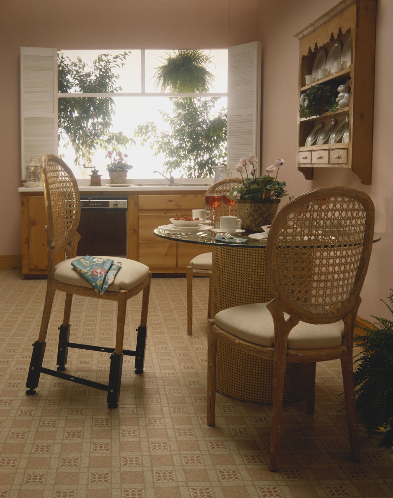
3. Rattan, wicker, and caned furniture

Sire Design, Miami Interior Designers, Eilyn Cueto
Though we can't vouch for what's going on at the bottom of this chair.

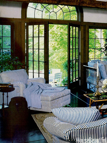
4. Ticking stripe upholstery

Sire Design, Miami Interior Designers, Eilyn Cueto
It nodded to the French/English country looks popular at the time, along with the craze for all things blue and white.

6. The "contemporary" look

Sire Design, Miami Interior Designers, Eilyn Cueto

It was the natural progression of the streamlined modern look in the decades before, featuring bold geometric elements and spare, clean lines.

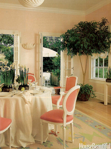
7. Pastel walls

Sire Design, Miami Interior Designers, Eilyn Cueto

These soft shades just have a soothing quality.

8. Neon accessories

Sire Design, Miami Interior Designers, Eilyn Cueto

IT's the other side of the '80s coin, as far as colors go. These intense hues crept into the home realm from the runway in surprising ways, like in this living room.